MDONE
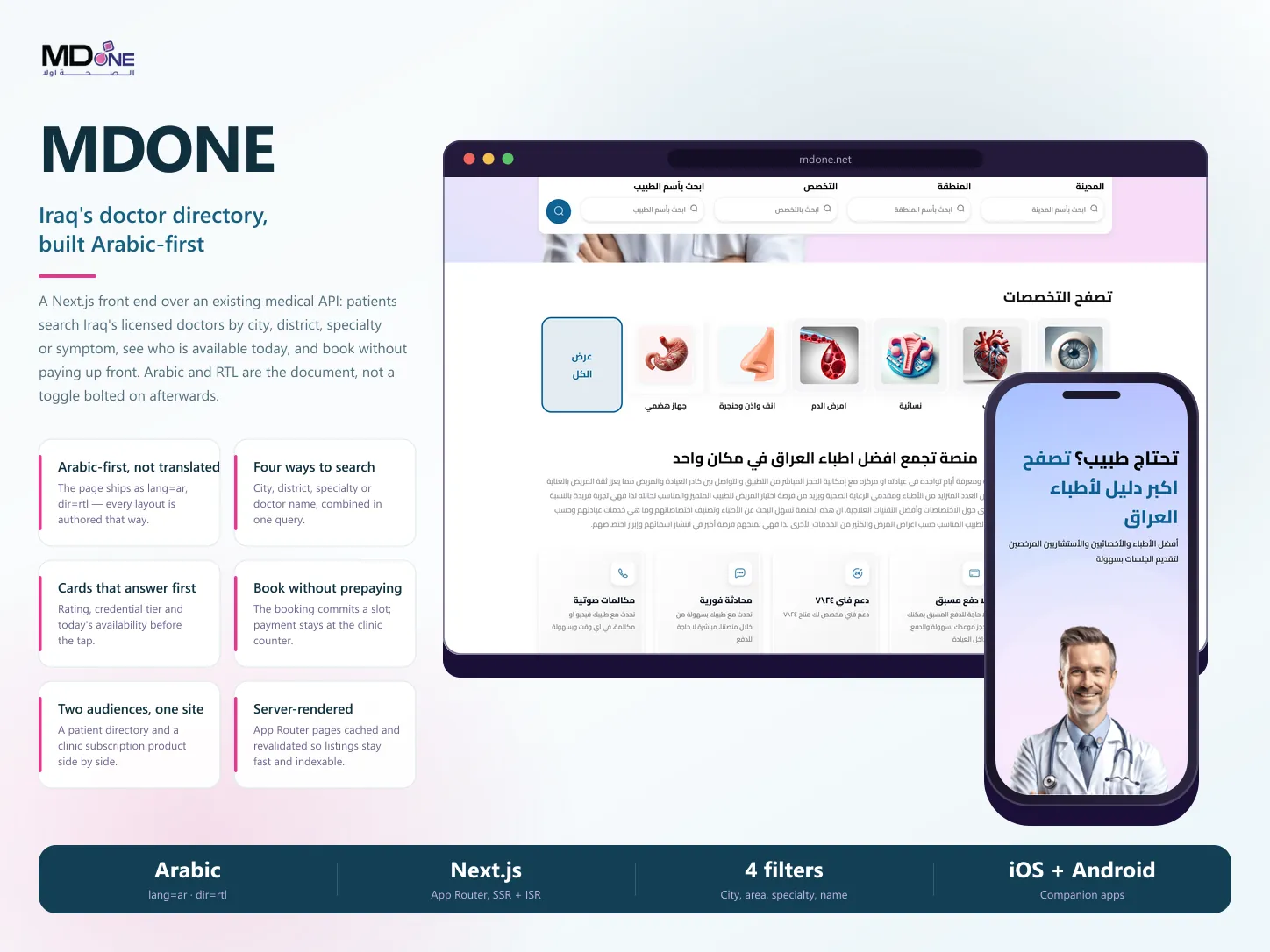
The Arabic-first web front end for Iraq's doctor directory: patients search licensed doctors by city, district, specialty or symptom, see who is available today, and book without paying up front — with a second surface selling the clinic subscription behind it.
- Role
- Front-end development · Next.js implementation over the existing API · Independent engagement
- Services
- Next.js App Router front end · Arabic-first RTL interface · Doctor directory & multi-filter search · Doctor profiles & booking entry · Clinic subscription comparison · Offers & specialty browsing · Responsive & mobile layouts · SEO metadata & rendering strategy
- Stack
- Next.js · App Router · React · TypeScript · Arabic RTL · REST API · ISR / SSR
- Client
- MDONE
- Industry
- Healthcare
- Timeline
- 6 weeks · 2025
01 / Business context
The Problem to Solve
MDONE had the platform — a medical API, clinic dashboards, and mobile apps — but needed a web front end that could carry two very different audiences at once. A patient in Baghdad who does not know the name of the specialty they need has to reach the right doctor in a few taps, while a clinic weighing a subscription needs the plans laid out clearly enough to choose from. Both had to work in Arabic, right-to-left, as the native experience rather than a translated layer.
MDONE is a doctor directory and appointment platform for Iraq, connecting patients with licensed doctors, specialists, and consultants, with companion apps on iOS and Android. My scope was the web front end: a Next.js App Router application built Arabic-first over the platform's existing API, covering the patient directory and its search, doctor listings and profiles, the booking entry point, clinic offers, and the MD One Business subscription pages. The backend, clinic dashboards, and mobile apps were built by the platform's own team.
02 / From Scope to Launch
How the Work Moved
The work became clearer through decisions, working increments, and feedback—not a long wait for a final reveal.
05 Steps
Step 01
I started from the two journeys the site has to serve — a patient trying to find a doctor and a clinic deciding whether to subscribe — and treated them as separate paths through one interface rather than one homepage trying to speak to both.
Step 02
I built the interface Arabic-first: the document itself ships right-to-left, so mirrored layouts, iconography, and typography were authored that way instead of being flipped at the end.
Step 03
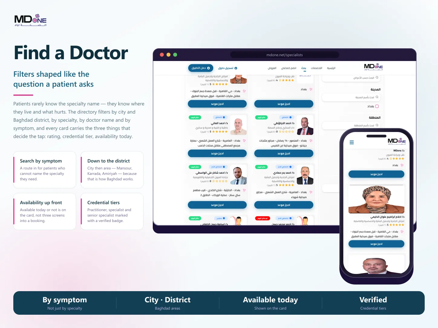
I shaped search around how patients actually describe the problem — city, then district, then specialty or symptom, then doctor name — and made all of them combinable in one query against the existing API.
Step 04
I designed the doctor card to answer the questions that decide a tap before it happens: rating, credential tier, and whether the doctor is available today.
Step 05
I rendered the listing and detail pages on the server with cached revalidation, since a directory earns most of its traffic through Arabic search rather than direct visits.
03 / Decisions that shaped the product
Key Product Decisions
Arabic as the document, not a toggle
- Business context
- A bilingual-ready build would have meant designing left-to-right and mirroring afterwards. For a product whose entire audience reads Arabic, that only imports layout bugs the audience is the first to hit.
- Decision
- I built the site as Arabic-only from the document down — the page ships as `lang=ar` and `dir=rtl`, with every layout, icon direction, and form flow authored right-to-left.
- Why
- Nothing has to be mirrored under pressure later, and the details that usually break in retrofitted RTL — input alignment, carousel direction, breadcrumb order — were simply never wrong in the first place.
Filters shaped like the patient's question
- Business context
- Directory search defaults to specialty, but a patient often cannot name the specialty they need, and 'Baghdad' is far too coarse when the real question is which side of the city the clinic is on.
- Decision
- I built search around four combinable inputs — city, district, specialty or symptom, and doctor name — with the district list narrowing to real Baghdad areas once a city is chosen.
- Why
- It lets the patient start from whatever they actually know, and searching by symptom gives an entry point to everyone who would otherwise have to guess the medical term before the site could help them.
Let the card answer before the tap
- Business context
- A directory that only shows a name and a specialty forces the patient to open several profiles to find one doctor who can actually see them, which is the slowest possible way to fail.
- Decision
- I put the three deciding facts on the card itself — rating, credential tier with its verification badge, and whether the doctor is available today — with unavailability marked as clearly as availability.
- Why
- Most of the filtering happens by eye on the results page instead of through repeated navigation, and a patient who needs someone today can see who that is without opening anything.
Server-rendered because a directory lives on search
- Business context
- Almost all of this traffic starts as an Arabic search for a specialty or an area, not as a direct visit — so pages that only exist after the client fetches them are pages that mostly do not get found.
- Decision
- I rendered the listing and content pages on the server through the App Router, with cached responses revalidated in the background and Arabic titles, descriptions, and keywords set per page.
- Why
- Listings arrive already rendered for both the patient and the crawler, and caching keeps repeat visits fast without the directory ever serving a stale-looking empty state while it loads.
Two audiences on one site, kept apart
- Business context
- The same platform sells to patients and to clinics. Blending the two makes the patient wade through pricing they will never pay and leaves the clinic hunting for the plan comparison.
- Decision
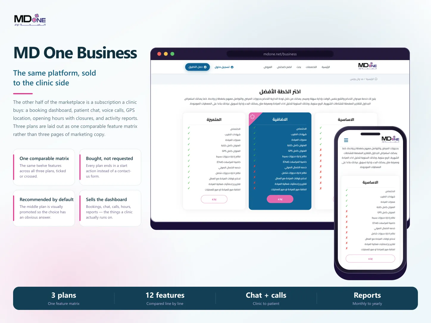
- I kept the patient directory and the MD One Business subscription as distinct paths, and built the plans as a single comparable feature matrix — the same twelve capabilities ticked or crossed across three tiers — with the middle plan visually promoted.
- Why
- Each audience gets a route that matches what they came for, and a clinic can compare plans in one glance rather than reading three pages of marketing copy and inferring the differences.
04 / The product in use
What Was Built
Real interfaces across the customer and operational experience.
05 / How it was built
Engineering Decisions
Next.js App Router front end built against the platform's existing REST API, with server components rendering the directory, specialty, offers, and business pages.
Arabic-only interface delivered at the document level (`lang="ar"`, `dir="rtl"`), so RTL is the default layout direction rather than a stylesheet override.
Doctor search combining city, district, specialty or symptom, and doctor name into one query, with district options scoped to the selected city.
Result cards surfacing rating, credential tier with verification badge, availability for the day, and clinic address written as local landmarks the way Iraqi addresses are actually given.
Server-rendered pages with cached revalidation and per-page Arabic titles, descriptions, and keywords, so the directory is indexable in the language its audience searches in.
MD One Business plans built as one comparison matrix across three tiers with a promoted middle plan and a direct start action on each.
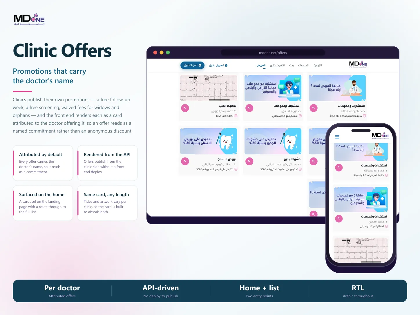
Clinic offers rendered from the API as cards attributed to the doctor offering them, surfaced both as a carousel on the home page and as a full list.
Responsive layouts down to mobile widths, alongside the platform's own iOS and Android apps which the site links out to.
06 / What changed
Delivered Outcome
MDONE's web presence delivers the patient directory and the clinic subscription offer as two clear paths through one Arabic-first site.
Patients can search by city, district, specialty, symptom, or doctor name, and judge availability and credentials from the results page itself.
Clinics can compare all three subscription tiers as one feature matrix and start from the plan page rather than through a contact form.
Listing and content pages are server-rendered with Arabic metadata, so the directory is reachable through the searches its audience actually runs.
Delivered as a six-week front-end engagement on top of the platform's existing API and mobile apps.
Facing a similar product challenge?
Bring the problem, the current state, and the outcome you need. We can turn that context into a clear product direction and a workable path to launch.